In our last blog, we outlined the basics of branding and discussed how your brand can add or detract from your success as a business. Now, we want to show you a few brands we think are winning at the branding game. Read on to discover a few examples of strong, effective branding and why we think their brands are hitting the mark. Some are even FatRabbit clients!
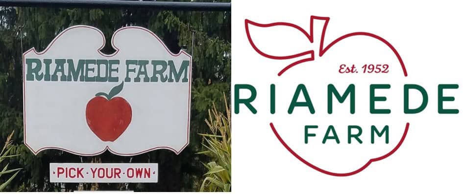
(Left is before rebrand, right is rebranded)
Riamede Farm came to our team to refresh their logo, business cards, and print materials. This was inherited from the previous owners and did not reflect the path the new ones wanted to take in building their business. The farm’s new owners wanted a clean, modernized logo that reflected their top-notch service, farm-to-table events, and to distance themselves from other “fun-griculture” reputations (think Pumpkin chucking). We were challenged to design a logo that was both modern and classy while homage to the history of the farm.
Choosing to keep the classic red and green colors, our team updated the brand with a modern typeface and a more realistic bet classic apple. Adding “Est. 1952” provides a nod toward the history of the beautiful farm. A sans serif font replacement for the name made it appear more high-end compared to the western font in the old brand. The result: a brand that reflects the classy updates to this Chester favorite.
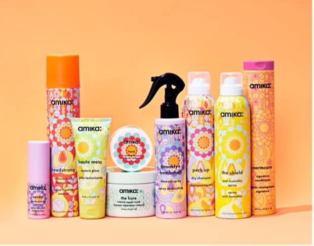
Source: loveamika.com
The amika hair care brand is one of the most recognizable on the market. The bright colors combined with swirling, mandala-like patterns create an eye-catching background on their product bottles. As “a collective of creatives, hairstylists, chemists, and product enthusiasts that like to bend the rules,” amika’s brand does an amazing job of reflecting who they are and what they have to offer. In a sea of plainly-branded competition in beauty aisles across the US, amika is sure to stand out!
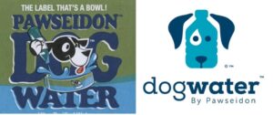
(Left is before rebrand, right is rebranded)
Sometimes less really is more. Dogwater by Pawseidon approached FatRabit to create a minimalistic and professional logo. Their innovative product is a water bottle with a plastic bowl wrapped around it so when hiking or road-tripping, you can ensure your furry friend also stays hydrated. As you can see, we chose to literally interpret the log and intention behind the product in a fun, whimsical way.
Source: ShelfPackaging.com
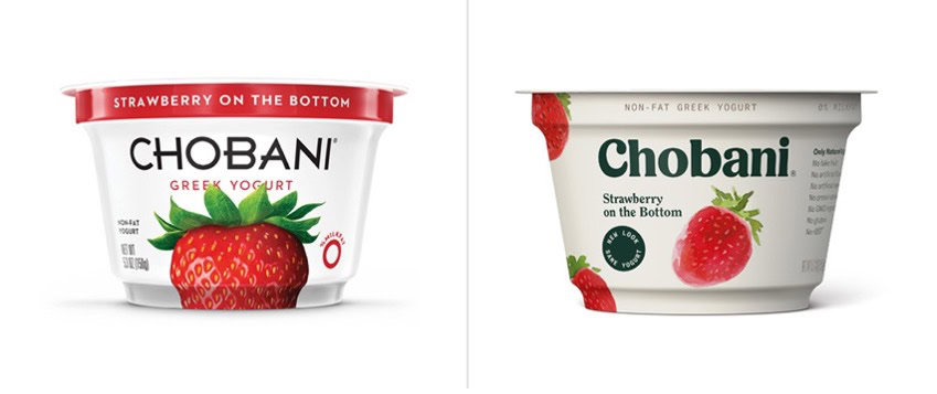
Chobani chose to complete an entire rebrand in 2020. Why? They didn’t feel as if their brand imagery reflected their true voice and wasn’t attracting the right buyers. Wanting to appeal more to those seeking organic, natural brands, Chobani chose hand-painted artwork and natural palettes for their new imagery. They completely changed from their bright white backgrounds and sans serif, mechanical fonts to off-whites and neutrals with a more detailed, serif font. Choosing several hand-painted fruits over one stock image also gave the branding a more “organic” feel. Today, Chobani is still one of the biggest yogurt brands on the market, just with a more true-to-self feel.
![]()
The Maple Shop came to the FatRabbit team with zero brand imagery. This local company knew they wanted to promote their high-quality Vermont maple syrup and farm, while still promoting their Chester storefront and their local New Jersey community. With pancakes and winter mornings on our minds, we illustrated a cozy and relatable logo highlighting their farm and Chester shop. Keeping the color palette natural with browns and yellows allowed us to reflect trees and, of course, syrup!
Like what you see? We’d love to talk about how we can elevate your brand. Check out our branding package and give us a call!